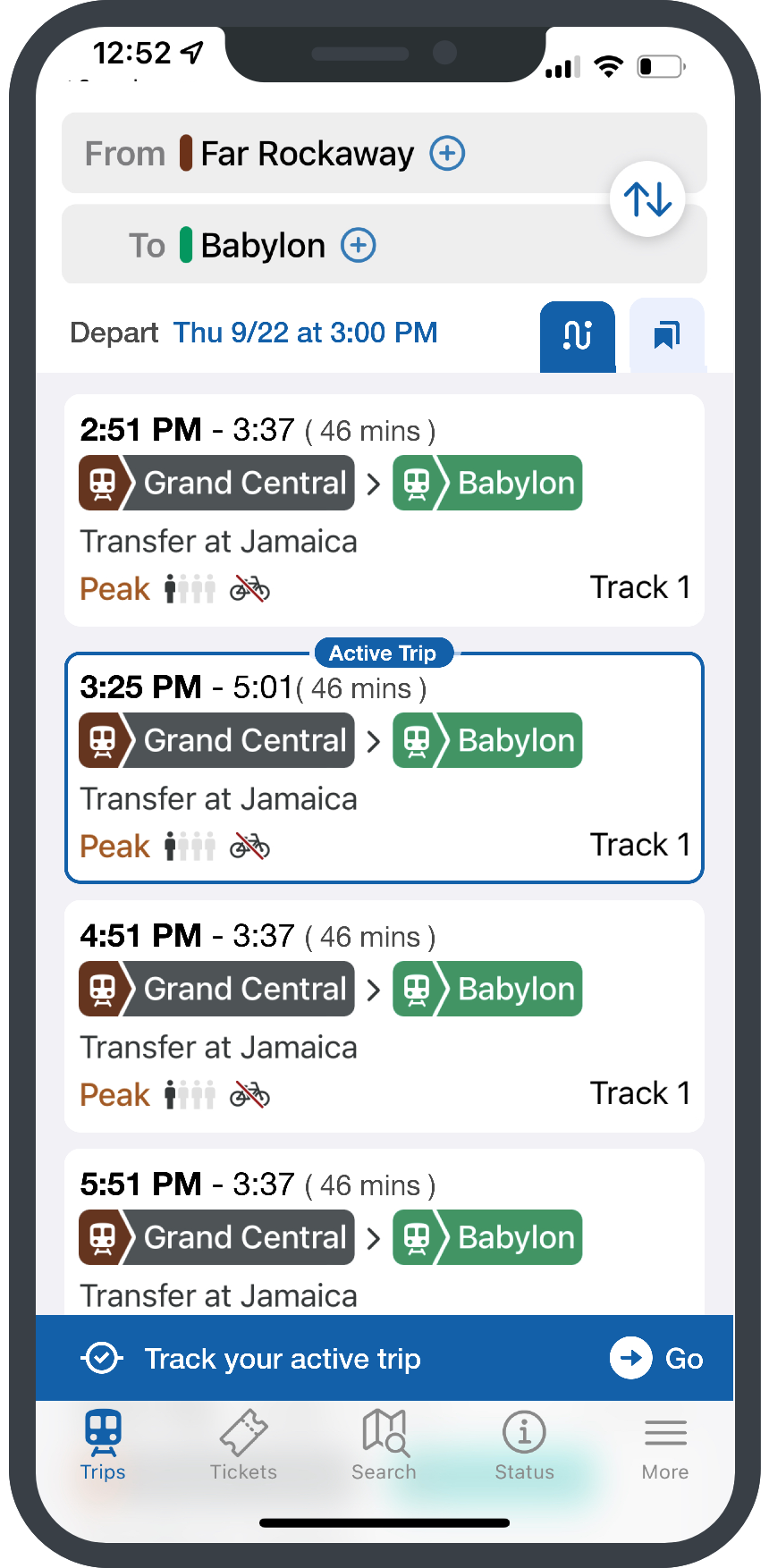
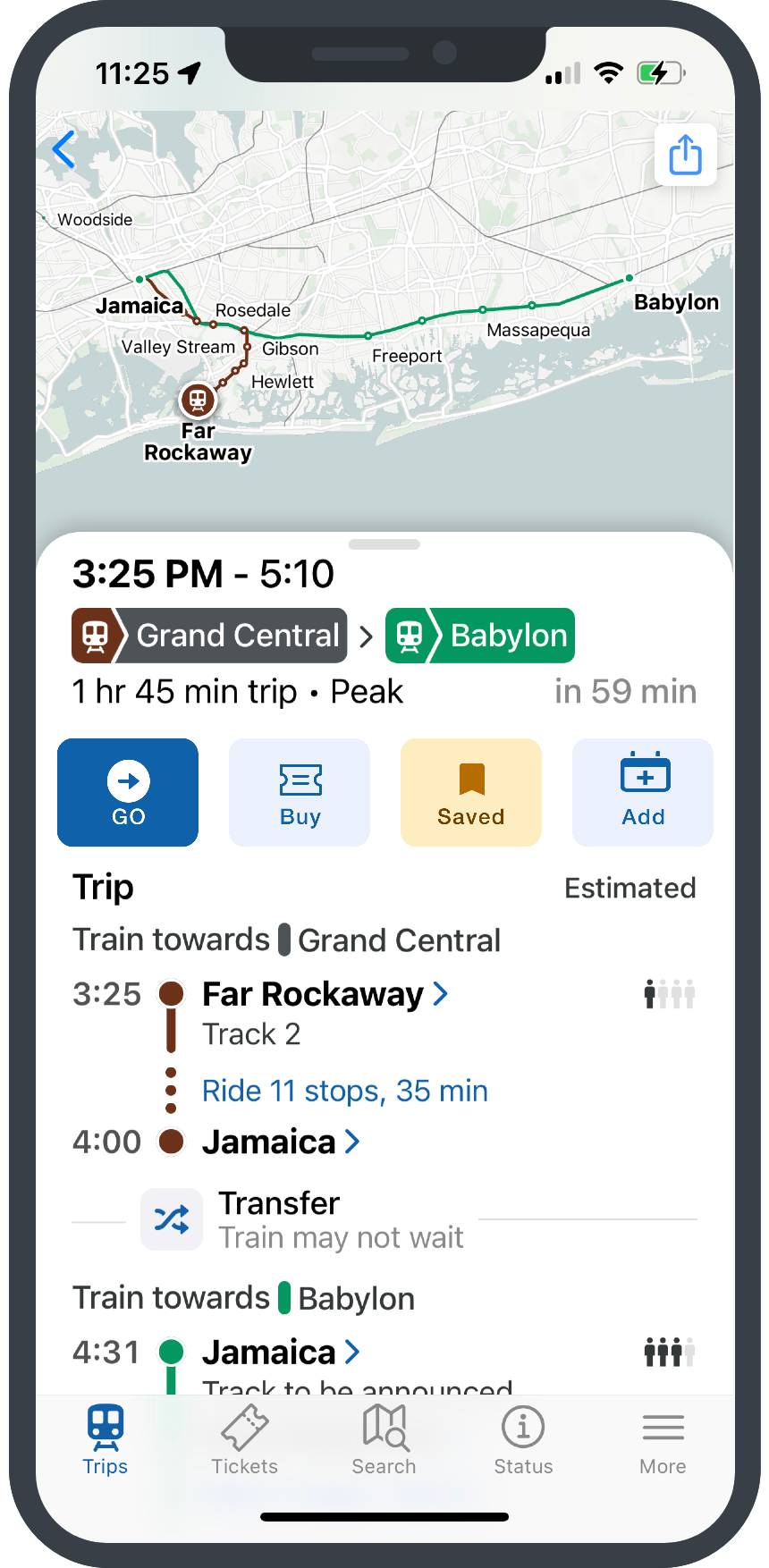
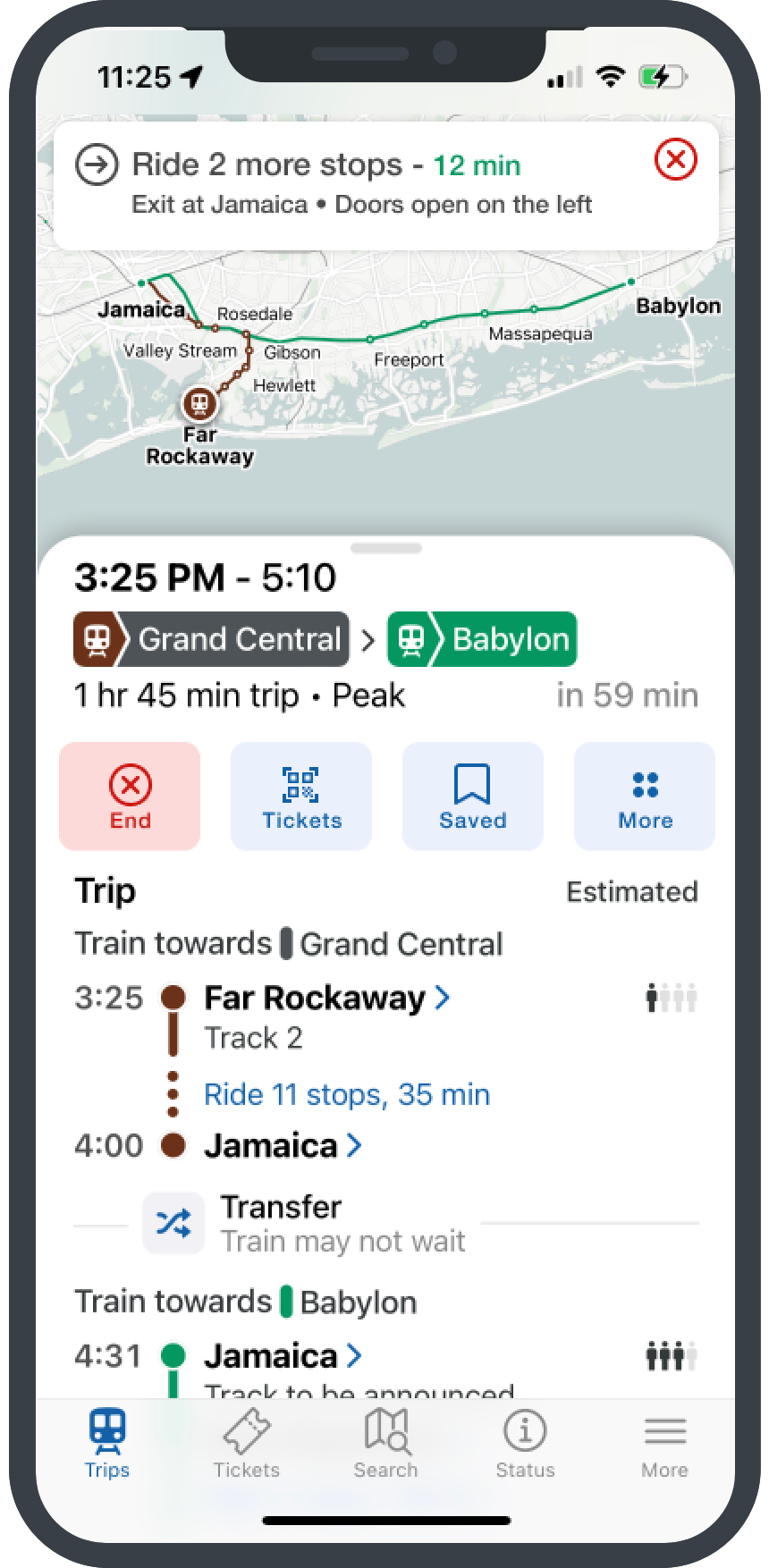
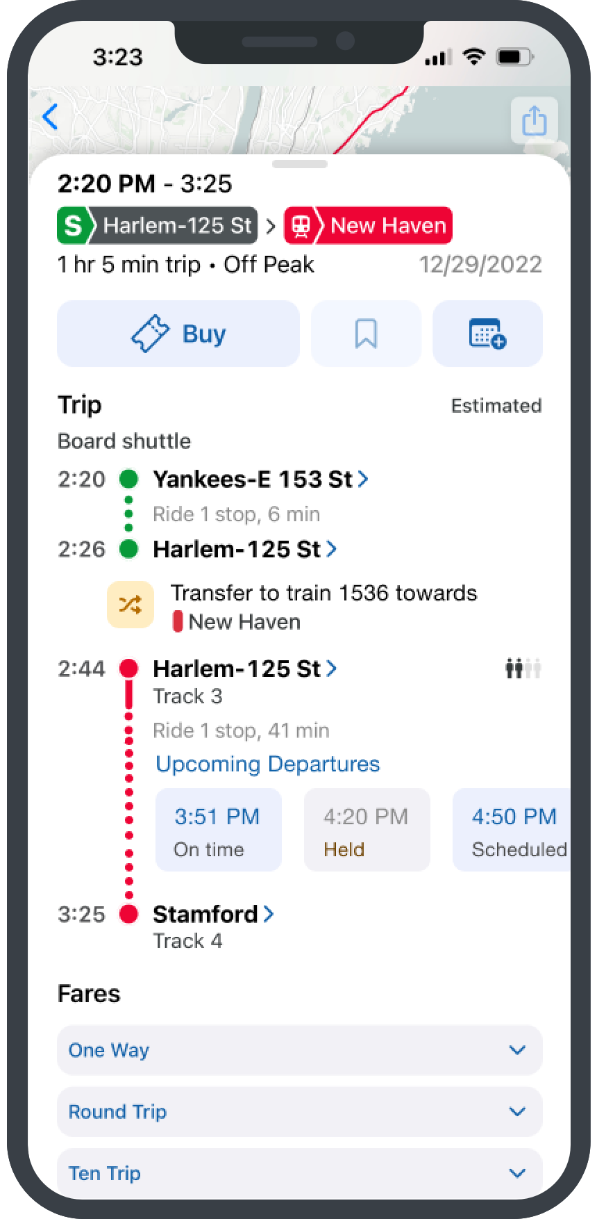
The Problem
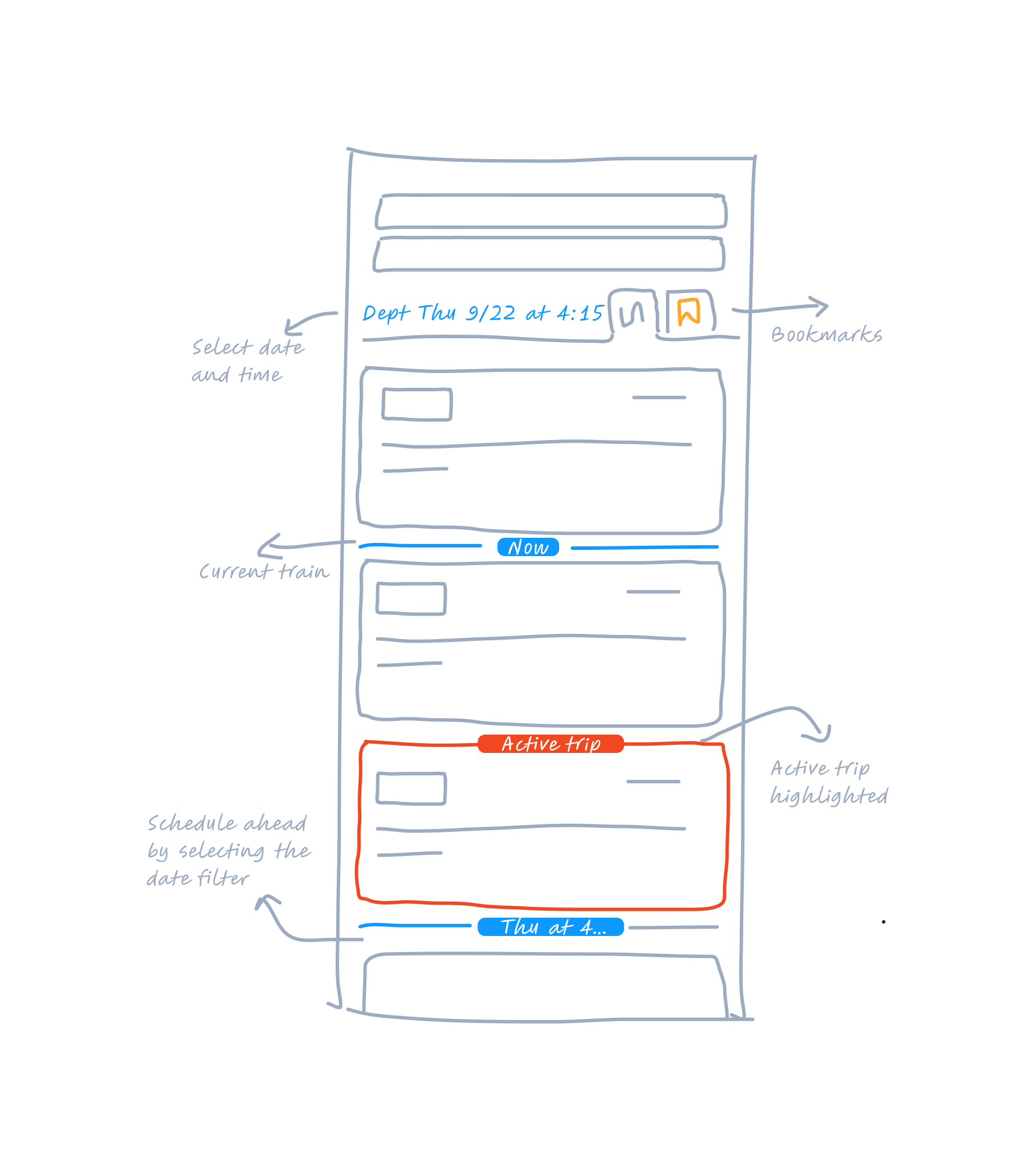
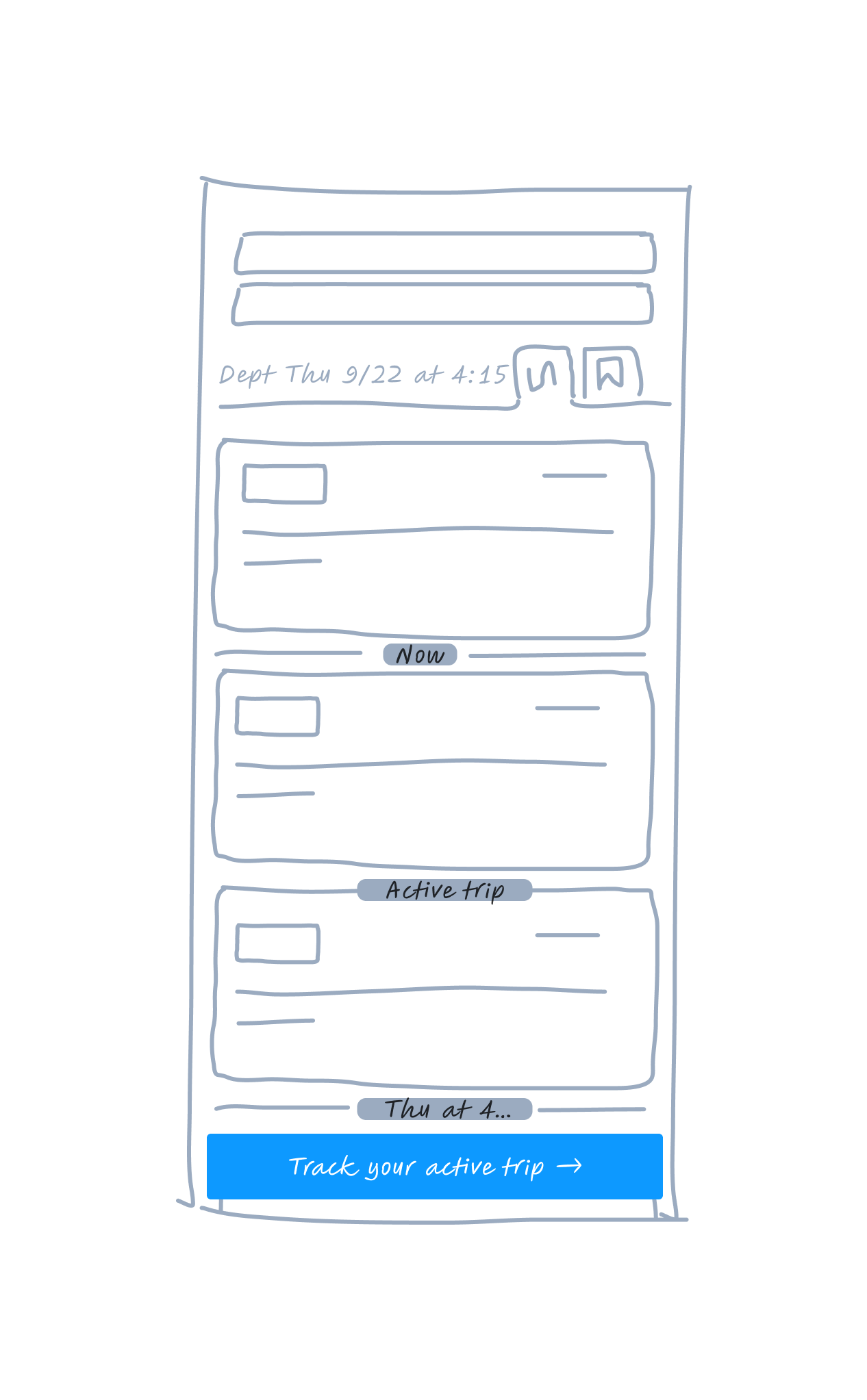
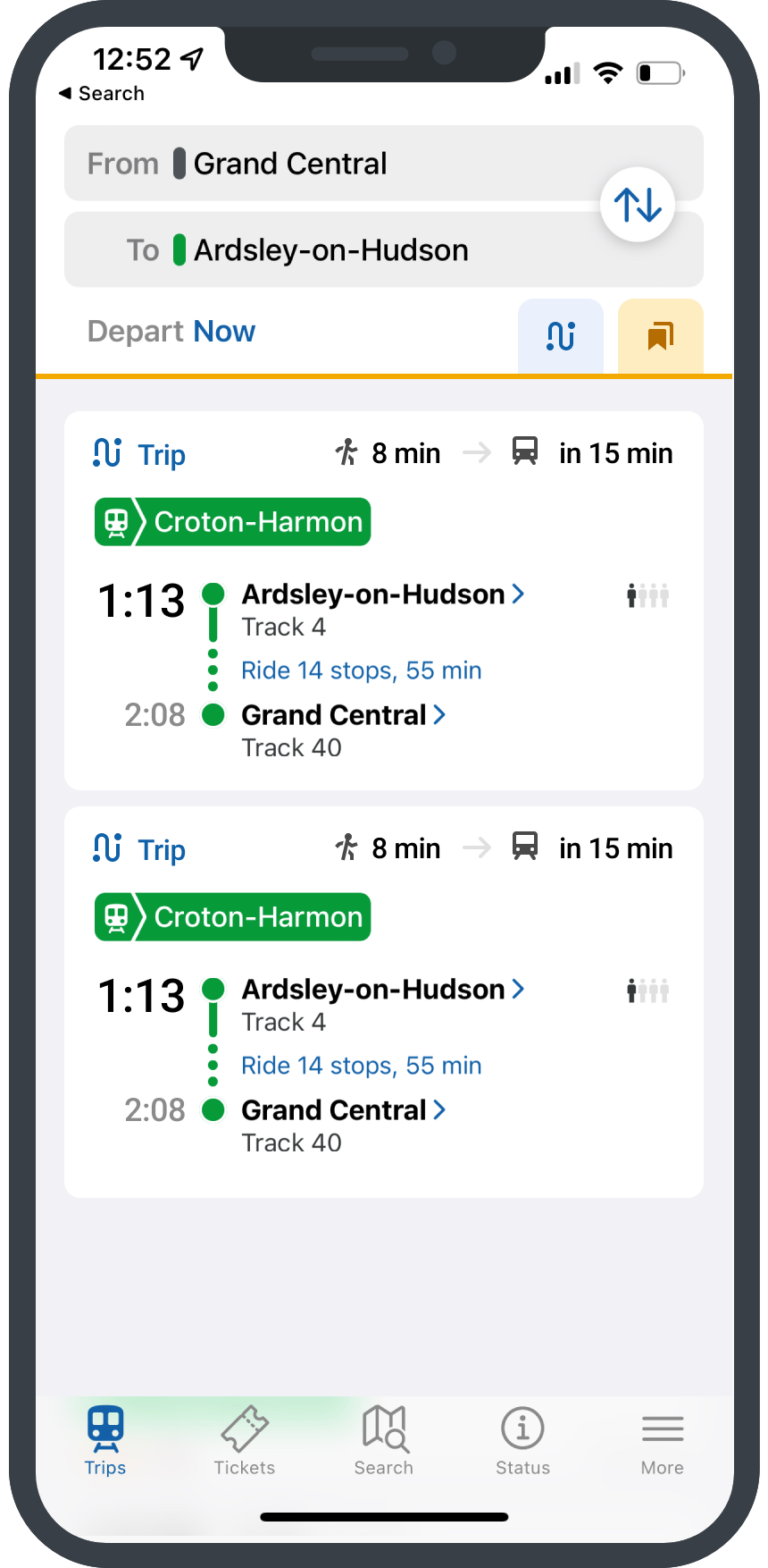
The current search results display an overwhelming list of trains with an infinite scroll, significantly slowing the app's performance. Identifying a user's active trip to view journey details has proven difficult, as there is no clear visual distinction between past and future scheduled trains. This lack of clarity makes it challenging for regular commuters to efficiently find and book their routine train services in the extensive list of options.
My Approach
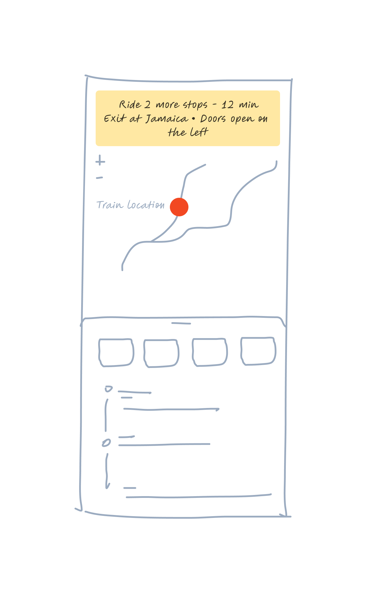
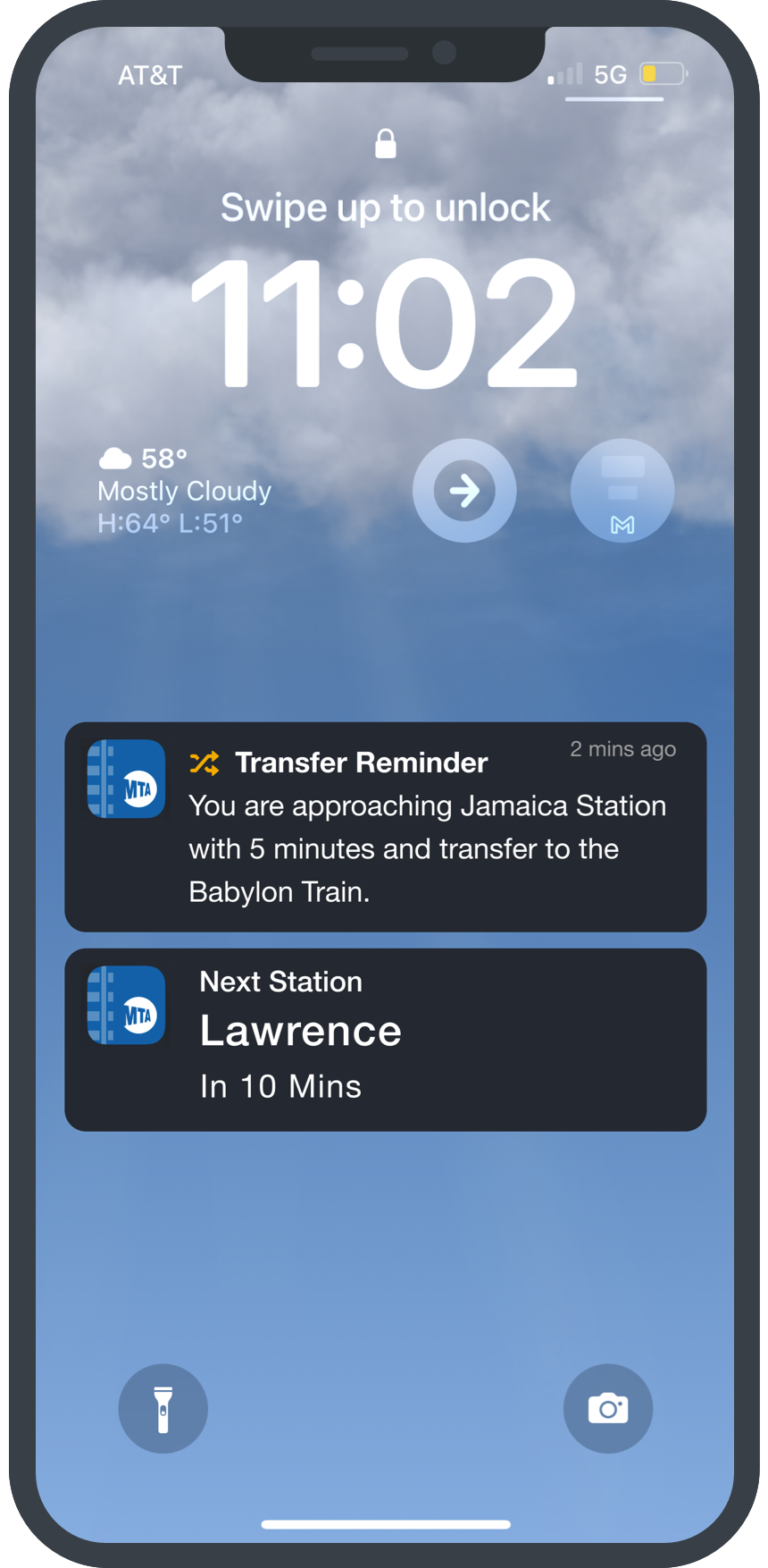
These user experience pain points must be addressed to streamline the app's functionality and better meet the needs of TrainTime's core commuter audience. Optimizing the search results display, enhancing trip tracking capabilities, and introducing visual cues to differentiate past, present, and future trains will be crucial to improving the overall usability and value of the application.
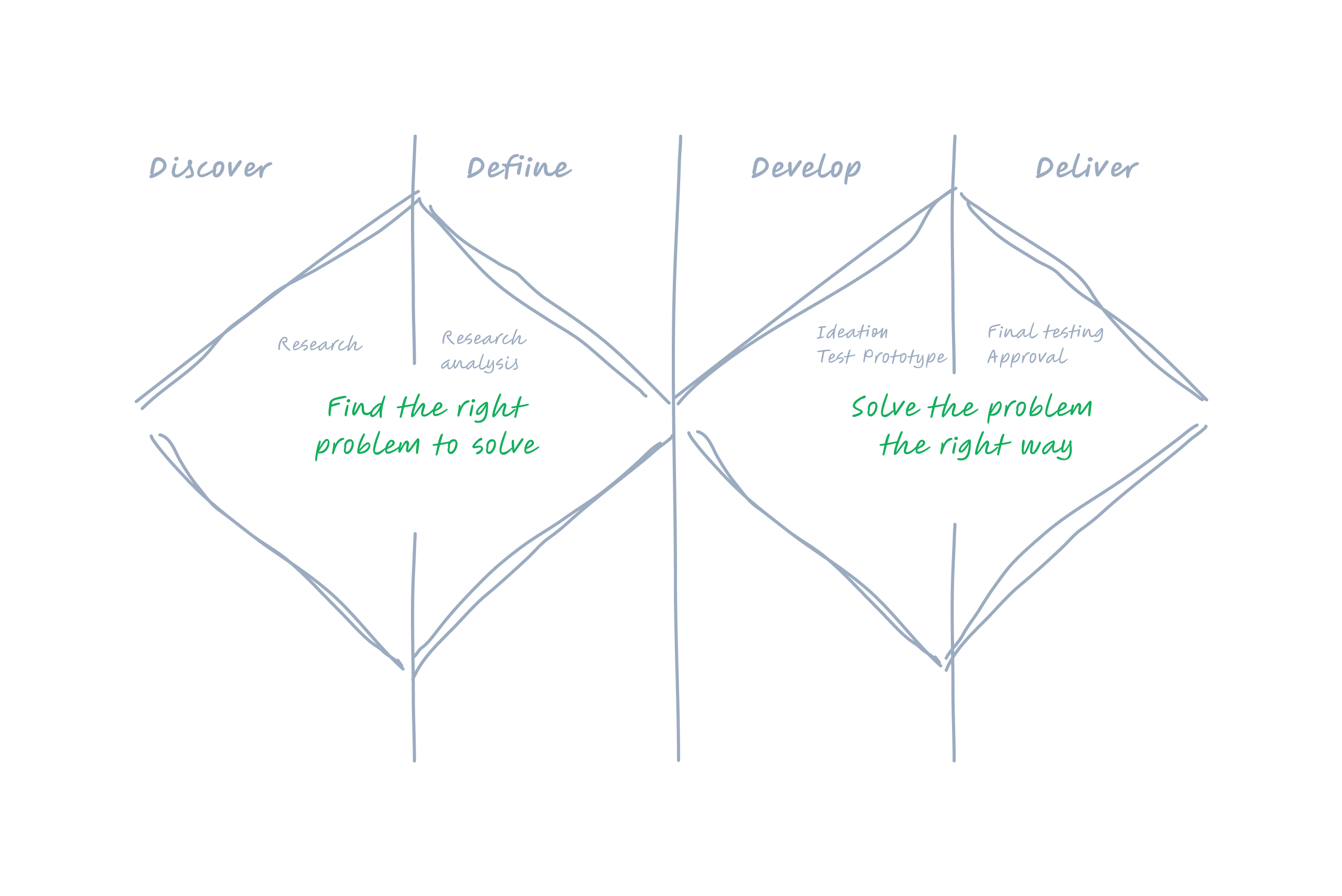
Research
This was my first task at MTA. Unfamiliar with the app and transport industry, I started with secondary research to understand market trends and the current app version. I then led brainstorming and sketching sessions with business owners and developers to explore the underlying technology and identify performance improvement opportunities. Additionally, I analyzed user comments, feedback, and reviews to gain insight into customer needs and pain points.
Roles & Responsibilites
- As a UX mobile app designer, my roles and responsibilities include creating intuitive user interfaces, conducting user research, prototyping designs, collaborating with developers, and testing usability. Also, stay updated on current design trends, ensure a seamless user experience, and advocate for user-centered design principles throughout the app development process.
- Work closely with product managers, software developers, and leadership to communicate the UI/UX vision, discuss trade-offs, and make informed decisions.
Tools
Figma, Monday.com, Mural,